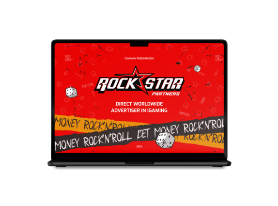
Rockstar
partners brand guide
Logo
When creating the Rockstar Partners logo, we took into account not only the rules of design but also the brand's characteristics, its values, and target audience. Every line, every element, and grid were developed considering the desired impression and emotional impact on the viewer. This helps strengthen brand recognition and convey its unique traits through the logo.
Brand Colours
The main accent colour are Luminous Bright Red and deep yellow, the complementary colours are black and white.
Luminous
Bright Red
Deep Yellow
White
Black
Typography
The EXO font is a sans-serif font collection by designer Nathan Gami, featuring 18 styles and weights (bold, italic, decorative). It is used for text elements, headers, logos, and graphics. Zaychik is a Cyrillic handwritten font that mimics brush handwriting. It is suitable for rebellious and expressive themes.
Pattern
A pattern is a repeated design or motif used in design to create visual interest and harmony. Patterns can come in various shapes and sizes, and they can consist of lines, geometric shapes, or organic elements.
Graphic Elements
Graphic elements are various images in design used to convey information and enhance document layout. They include illustrations, photographs, graphics, charts, diagrams, and other visual materials. They help improve information perception, engage the audience, and convey ideas.

Do you
wanna rock?


